
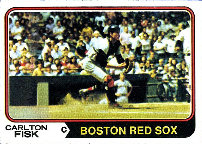
Today's "do-over" is the 1974 Carlton Fisk card, #105 in the set.
While I do like the action shot, sadly Fisk is almost lost in the
crowd that makes up the background. It's almost like he's on the same
plane as the crowd, blending in perfectly instead of appearing in the
forefront of the shot. He doesn't "pop-out" in
the picture.
I ended up choosing a cleaner image from his days with the Red Sox
(though admittedly I think it's from a couple years later), and I tried
to give it that "lesser quality" that the original picture has. However
after a few filters and messing with the
saturation and contrast, I couldn't get rid of that "clean" look so I
stopped and let it fly the way it was.
Definitely an improvement I think, as it fills the horizontal orientation a bit more while still keeping that action-feel.
On a side-note I noticed something on the original card I never
spotted before: there's a problem with the original photo to the left of
Fisk, where the image seems like it got wrinkled or cut. Check it out,
just about where the guy in the yellow shirt
is in the front row. It runs straight up from yellow shit to the top of
the frame.
Oddly enough, it only runs vertically in the "crowd area" of the shot. Check out one of the images below where I circled it.
I never noticed this before, and have never heard anyone mention it either. Strange.
 |
| Topps issued Carlton Fisk, #105. |
 |
| My re-done version. |
 |
| Film error/smudge on card. Never noticed this before. |