Sunday, June 30, 2013

"IN MEMORIAM" PART I: LYMAN BOSTOCK

When Thurman Munson died in 1979, I was ten years old and was crushed by what happened to my favorite player. As a kid that young I remember this was the first time I dealt with a "famous" person that I really followed dying suddenly.
The following year when the "new" cards were about to come out, a bunch of us were wondering what the Munson card would look like. In our young naive minds we seriously were expecting Topps to have some sort of "last card" for him, and it took a while (and quite a few packs) before we realized that Munson was actually not included in the set.
Talk about being crushed again! We were pissed off that Topps didn't make a card for the "Captain", and we couldn't get an answer as to why.
To be honest, I STILL don't have an answer. But I kind of get the feeling a big part of it may have been what one guy said to me years ago, "Cards are mainly for kids. Why throw death into it all?" Simple enough right? And I'll settle for that.
However, over the years  I took an interest in players that died an untimely death, and paid a little extra special attention to those "last" cards. Ever since I came across the Ken Hubbs "memorial" card from the 1964 set, I always thought back to Munson, and some other players who died young, and wondered what memorial cards of them would have looked like.
Sadly, the 1970's had quite a few baseball players that died young and I wanted to do a "In Memoriam" thread on this blog, having that "last card" with a call-out in memory of the player as a fitting close to their careers. I don't want to have a unique design as the Hubbs card has, but a simple stripe or bar with the words "In Memoriam" in black and white on the standard card design of that year.
These players fall into two groups: the first are those who died before their last card was actually issued (think Don Wilson '75, Gil Hodges '72, etc). For these players, I use that last officially released card and add the call-out somewhere in the design.
The second group are players who died during the season, and never had a card the following year for obvious reasons (Munson, Danny Thompson, etc). For these players I've gone and created a card for the following year's set.
I won't get into the tragedies here. I'll just keep it to baseball cards and a nice way to memorialize the player in the context of this blog.
I will also hold off on the Munson card since it would fall in 1980, just outside the scope of this blog. I've seen one or two designed by others in the past, and I know Bob Lemke told me he was working on one in the near future. But don't be surprised if I come back and add that one later on. 
Today however, I begin this "Memorial" thread with Lyman Bostock. Great player, rising star and tragic story. You can Google what happened if you don't know already.
Here I designed a 1979 card for him with the "In Memoriam" call-out since he died late in the '78 season, and a card the following year was never produced.
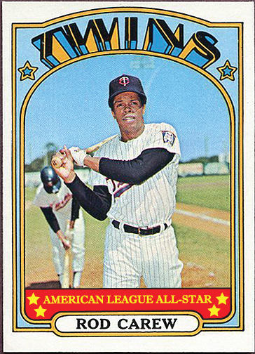
As a baseball fan, I have always wondered how much more dominant that 1979 Angels team could have been had Bostock been able to play alongside Carew, Baylor, Downing, Lansford, Grich et al. That team was offensively loaded that year and kind of forgotten as time passed.
Such a shame.
November 22, 1950-September 23, 1978.

Saturday, June 29, 2013

"WHAT WERE THEY THINKING?!"- PART V

The 1973 George Scott Topps baseball card, #263.
This card has held my fascination for over 30 years now. When I first saw it I thought it was a simple bad-airbrushing job. Then, as I took a closer look, I was confused because there was this odd outline around the players, especially Scott, that made it seem that they were cut out of one photo then pasted onto this another.
But wait, it continues!
Upon an even CLOSER look, I noticed that the crowd was looking somewhere else completely, and it was now obvious that indeed, the players and the crowd were from two different images.
Just look at it. What was going on here? 
And if all of that wasn't enough, another question I always had was that if Scott was playing first base, then you'd assume the play being shown was of a pick-off attempt with the A's Bert Campaneris just getting back to the bag before the throw. But look at Campy. It doesn't look like he's sliding back to the bag on a pick-off attempt, but that he's sliding into a bag at full steam, as if he's advancing, NOT sliding back to first. It's almost as if Scott was actually playing third base and was waiting for a throw while Campy was sliding in for a triple.
Now keep in mind that Scott did indeed play some third base for the Brewers in 1972, and I can't really confirm that he has a first baseman's mitt on. It could be a regular fielder's glove. Am I wrong? Anyone out there have any answers on this one? Is the crowd actually looking towards home? When looking to the left of the card, are you looking NOT to the outfield, but in the direction of home plate?
Such a strange card all-around. Where was that crowd image from then? Why the need to use a different background than whatever was originally there?
It's not a horrible card by any means, but just confuses me on so many levels I'd love to get the low-down on what went on here. 
It's cards like this that keep me coming back to the 1970's! Love it…
Just what IS going on with this card?!

Friday, June 28, 2013

MISSING IN ACTION- 1977 DICK ALLEN

Even though Dick Allen was granted free agency in November 1976 and didn't sign with anyone until March of 1977, you think Topps would have at least produced a card of the guy in a Phillies uniform.
This was one of the star players of the previous ten years, albeit somewhat under appreciated and misunderstood to say the least, but he wasn't exactly "done" as a player yet.
1976 was a somewhat productive year for a guy who had 298 at-bats, good enough for 15 homers, 49 RBI's and a .268 average. In an era where 38 homers lead the N.L., that's pretty decent output over the course of a full season.
Anyway, I never did hear a reason why Allen was not included in the 1977 set, but I went ahead and created one here.
Since I have the gift of hindsight all these years later, I created an Oakland A's version, even though this wouldn't have been the case back then since as I stated earlier, he didn't sign with them until about Spring Training.
The Oakland choice was too easy since I still love that uniform, and he famously had "Wampum" (his home town) as his name across the back above his number, which is visible in the image I used for the recreated card.
By the way, if any of you out there have never read his book: "Crash-The Life and Times of Dick Allen", you really should pick up a copy and do so. One of my favorite baseball books and some incredible insight into the "character" that was Allen as well as some of the behind the scenes crap that goes on in the sport. As with Allen the player, his book is also grossly underrated.

One of baseball's most controversial players in his final season.

Thursday, June 27, 2013

"GIMME A DO-OVER"- PART IX: 1973 #480 JUAN MARICHAL

Ugh.
Ok, I know I'm getting a bit repetitive with the 1973 set, but come on! Just look at this image.
This is Juan Marichal, one of the greatest pitchers of the a generation with one of the most photographic pitching wind-ups in history, and THIS is what they used?!
First off you have the batter dominating the foreground of the image, and to top it off his bat partially obscures Marichal's face. And let's not even get into the legs that are coming out of nowhere under the batter.
Bad bad bad.
As a kid I was mesmerized by the photos of Marichal winding up for a pitch. I used to wonder why I never saw modern day pitchers winding up like him or Warren Spahn. Classic baseball right there.
Anyway, I went ahead a re-did this card, using an image worthy of the Marichal legend, high-kick and all.
Topps issued card.

My re-designed version.

JUST FOR THE FUN OF IT- 1970'S BASEBALL TRIVIA PART IV


It's time for another round of 1970's baseball trivia. See if you can get all the answers before I post them up here tomorrow.

1. Who is the only player to lead the National League in home runs in a season during the '70's with less than 40?

2. Who is the only American League batting champ during the decade that never won a major award in his career (Rookie of the Year or M.V.P.)?

3. What pitcher threw a no-hitter, winning 4-0, thanks in part to the TWO homers he hit during the game?

4. What Minnesota pitcher posted a record of 17-5 while also saving 20 games, throwing an amazing 167.2 innings all in relief in 1976?

5. What Atlanta pitcher lead the N.L. with a sterling 2.28 E.R.A. in 1974, which happened to be the only season where he posted more than 162 innings in any of his seven year career?

***SPOILER ALERT! ANSWERS BELOW***

1. Mike Schmidt: 3 times. 1974: 36, 1975: 38 and 1976: 38

2. Alex Johnson in 1970.

3. Rick Wise, June 23, 1971.

4. Bill Campbell.

5. Buzz Capra.

ONE OF THE ALL-TIME CLASSIC CARDS: 1971 THURMAN MUNSON

When I started this blog, it was really with the intention of writing about my favorite cards, such as 1976 Johnny Bench, or 1979 Rod Carew, which I've already written about in past posts.
Since then I've kind of gotten sidetracked with all the other stuff, like recreating cards, pointing out funny or odd cards, or even creating cards that for some reason were missed altogether. 
As fun as that all is, today I'll go back to my original intent and write about a card that had perhaps the biggest impact on me upon first seeing it: 1971 #5 Thurman Munson.
While that '76 Bench card is still my favorite, the '71 Munson just absolutely blew me away when I first saw it at a card show back around 1980 or so. 
I was just getting into serious "collecting" and absorbing older cards like a sponge, and when I saw this card I thought it was the coolest card I ever saw. I swear I think it made me sweat because I wanted it so badly.
It had so much: the black card design, the horizontal orientation of that amazing action shot, and the super-cool "rookie trophy" on a card of one of my favorite players. It was just jaw-dropping.
All these years later I still think the card holds up well, and it's still one of my favorites. Add to the fact that to really get a "mint" copy of it, you had to search high and low and throw some decent cash around to get one, and it just grew in stature as the years went by.
I could never really tell who the Oakland A's player is making the slide at home. Maybe Joe Rudi? And check out the crowd in the background. Yes it's a little blurry and out of focus, but you can clearly see their transfixed stare at the play, waiting for the outcome.
It all makes for a classic card of a great player from the 1970's.
Man, that 1971 set is fantastic all-around isn't it?

Wednesday, June 26, 2013

THE THINGS YOU NOTICE AS A KID...

Once again, I bring up one of those things you notice as a kid, feverishly collecting cards and examining each and every one of them as they make their way into your collection: today it's the strange case of Leon McFadden and his two Topps offerings from 1969 and 1970.
I remember years ago making the connection between both photos that made up his two-time "career" on baseball cards.
McFadden was pretty much up in the Majors for "a cup of coffee" as they used to say. He played in 62 games between 1968 and 1970 on the Houston Astros, mainly as a shortstop.
After appearing in 16 games for his first taste of big league play in '68, Topps had him on a "Rookie Stars" card in 1969 along with Hal Gilson. The following year he appeared in 44 games, and Topps deemed it worthwhile to have him on his own individual card in their 1970 set.
What is so strange about the McFadden cards are the way he was posed. Take a look. For some reason on BOTH his cards he is looking far into the distance, with this almost "glazed" look in his eyes, while up against a brick wall.
Now, if ONE of his cards had an image like this, no big deal right? But why on earth does he have the same exact pose the following year, in front of what seems the same exact wall, but while wearing a cap this time around?! Was this a little bit of an inside joke with Topps' photographer? Could it really have been a coincidence? For some reason I find this hard to believe. And what was with that expressionless face? I'm not saying the guy had to be jumping for joy or anything, but some emotion (like Gilson) would not have been too much to ask for.
So strange for this guy to be slapped up against a wall and have the camera shoved right in his face two years in a row. Perhaps both photos were taken at the same time, and Topps went and used the second one the following year for lack of another shot?
Who knows? But it sure stuck with me after noticing it. Here are the cards:
"Please look straight ahead"

"Now to the right"
It reminds me of some of the early-70's basketball cards (I believe from the 1973 set) as well as a few of the 1977 football cards that seemed to be photographed in a stadium tunnel or hallway. They all had this creepy, sleazy feel to them, and of course, because of that, I was drawn to them!

Tuesday, June 25, 2013

THE GHOST OF GEORGE HENDRICK: 1972

For years I have been mystified by George Hendrick's 1972 rookie card. The ghostly airbrush job they did on it confused me to no end. 
Years later I figured Topps went ahead and airbrushed his uniform because they didn't have an image of him up in the "big leagues", but I couldn't understand why they apparently went ahead and continued the airbrushing on his face.
To make it all even more interesting, they also used a photo which had someone else on it, albeit obscured a bit, but now had to airbrush THIS player as well.
Was this a situation like the 1978 Greg Minton or Mike Paxton cards, where Topps didn't have a color shot of the player so they ended up using a black-and-white image?
If this was the case, why the strange, almost albino-like coloration of his face? It's like they lightened up his eyebrows and messed with his eyelashes too. Anyone out there have an answer to this one? Would love to hear it!
The airbrushing made the already NEON Oakland A's uniform burst out even more with all its psychedelic beauty!
Anyway, because of this "paint job", I DID always like this card. It was so weird and "otherworldly" to me and I'd always think of it when the topic of "odd cards" came up.
I remember I found this card at a flea market in Brooklyn, where you went through boxes of cards this guy had on these fold-out tables. It was $1.00 for 22 cards! This was around 1981. I walked away with about 400 cards, and had to explain to my dad why I was carrying this big box when I went back to meet my him after wandering around the market wondering where I was. I also remember how pissed he was that I managed to spend $20, all of my money, on something as ridiculous as "old cards".
Nevertheless I was flush with my "unbelievable find" (hey, I was 11 years old) and was on cloud nine all the way back home to Bensonhurst, staring at these "old" players and cards I never saw before.
Ah, those were the days!

Monday, June 24, 2013

ACCIDENTAL PHOTO BOMBING: PART IV

Man, I sure have a few gripes about the 1973 set, but one thing I WILL admit is just how good it was for spotting star players on other people's cards!
Today we have two of my favorite "accidental photo-bombs", both featuring plays at the plate.
One is a "before" shot while the second is an "after". That is, one card shows a play developing while the other shows the result of what seems to be a collision at the plate.
The first card is Topps Terry Crowley card, #302, with Crowley about to smash full-on into Yankee great Thurman Munson. Awesome photo here. The photographer even managed to get the ball just coming into the frame of the shot. Just the right moment. It's a shame the crowd is a bit out of focus because you can see them all fixated at what is about to transpire. Great card.
The second card is one of my favorite action cards of all-time, #542 Pat Corrales from the same set. It has everything: agony, flying dust and debris, and what seems to be an umpire about the throw out an arm for an "out" call. Look at Corrales face! He is writhing in agony from what I guess was the shot he took from none other than Hall of Fame pitcher Fergie Jenkins! Fantastic photo. But it seems Corrales had the last laugh since you can clearly see the ball in his hand. OUT!
These two cards show the successful side of "action cards" from the 1973 set that had so many "fails".

Crowley about to smash into Thurman Munson at the plate.

Corrales takes his licks against Fergie Jenkins and comes out on top!

PS- The Crowley card also reminds me of present day Yankee Stadium with the empty seats! No joke. I was just there this past Friday night and once again, there were a TON of empty seats, especially in the field level sections.
Seems like a bunch of those fake "johnny-come-lately" corporate fans that came out of the wood-work around 2000 have started to disappear. Good riddance!
It's also a pity that the new stadium happened to open right after the economy tanked in 2009, causing a bunch of companies to abandon all the "perks", including those high-priced seats around the field.

Sunday, June 23, 2013

"GIMME A DO-OVER"- PART VIII: 1974 #105 CARLTON FISK

Today's "do-over" is the 1974 Carlton Fisk card, #105 in the set.
While I do like the action shot, sadly Fisk is almost lost in the crowd that makes up the background. It's almost like he's on the same plane as the crowd, blending in perfectly instead of appearing in the forefront of the shot. He doesn't "pop-out" in the picture.
I ended up choosing a cleaner image from his days with the Red Sox (though admittedly I think it's from a couple years later), and I tried to give it that "lesser quality" that the original picture has. However after a few filters and messing with the saturation and contrast, I couldn't get rid of that "clean" look so I stopped and let it fly the way it was.
Definitely an improvement I think, as it fills the horizontal orientation a bit more while still keeping that action-feel.
On a side-note I noticed something on the original card I never spotted before: there's a problem with the original photo to the left of Fisk, where the image seems like it got wrinkled or cut. Check it out, just about where the guy in the yellow shirt is in the front row. It runs straight up from yellow shit to the top of the frame.
Oddly enough, it only runs vertically in the "crowd area" of the shot. Check out one of the images below where I circled it. 
I never noticed this before, and have never heard anyone mention it either. Strange.

Topps issued Carlton Fisk, #105.

My re-done version.
Film error/smudge on card. Never noticed this before.

Saturday, June 22, 2013

THE MISSING ALL STAR CARDS: 1973 TOPPS: NATIONAL LEAGUE

Here we have the final installment in my series of "missing all star cards" between 1971 and 1973. This time, for the '73 all stars from the National League, I gave them a red stripe running across the bottom, following the design introduced on my American League cards yesterday.
Of note is the fact that Willie Stargell is portrayed as a first baseman, with an action shot of him obviously manning that position. Yet for the second year in a row he was voted in as an outfielder.
One other noteworthy thing to mention is the fact that Roberto Clemente's card was a bit of a "memorial" card, as by the time it was released, he already died in a plane crash while on an aid mission to help victims of an earthquake in Nicaragua in December of 1972.
Well, this wraps up the "missing all stars" thread, and it was definitely fun to work on. I've been contemplating recreating all star cards from 1970 and 1974 where the "all star" designation is on the players' regular issue card instead of an all star sub set. If time allows I'll get that posted up sooner rather than later.


Friday, June 21, 2013

THE MISSING ALL STAR CARDS: 1973 TOPPS: AMERICAN LEAGUE

Continuing on this week's thread of all star cards, today we move on to 1973 and what I like to think Topps' cards would have looked like had they designated the previous years starters in the Midsummer Classic for the American League.
I kept the design simple to match the overall 1973 set design Topps used. The location of the "all star stripe" seemed to be a natural at the bottom. It keeps the image unobstructed while still calling out the "all star" designation.
After a win in the 1971 game for the A.L., which was their first since 1962, it was back to the losing side as they lost this one in extra innings, 4-3. As a matter of fact the American League would end up losing every All Star game up until 1983.
Of note here: the Freehan card is an excellent example of an "action shot" done right. The in-game action, the player clearly represented, and look at that crowd in the background. Awesome as they are clearly hanging on the play at the plate, waiting to see the outcome.
Carl Yastrzemski is called out as a first baseman on his card, but was voted into the all star game as an outfielder. Dick Allen was the starting first baseman for the A.L.
Tomorrow I'll post the National League starting nine.


Thursday, June 20, 2013

JUST FOR THE FUN OF IT- 1970'S BASEBALL TRIVIA PART III


Ok. It's Thursday, so here are the next set of trivia questions related to 1970's baseball. See if you get the correct answers before I post them tomorrow.

1. What team during the decade became the first with four players hitting 30+ home runs in the same season?

2. Two players during the '70's had a season where they hit 30+ home runs, as well as steal 50+ bases, though NOT in the same year. Who are they?

3. This pair of players had the good fortune of playing for both the N.L. and A.L. top one season wins teams of the '70's, the 1975 Reds and the 1970 Orioles. Who are they?

4. We all know that the Orioles had four 20-game winners on their staff in 1971. But who was fifth in wins on that staff, and how many?

5. What rookie whiffed 215 batters in 1975 to go along with his 2.88 E.R.A. and 15 wins?

***SPOILER ALERT! ANSWERS BELOW:

1. 1977 Dodgers: Steve Garvey, Reggie Smith, Dusty Baker and Ron Cey.

2. Tommy Harper (54 SB in 1973 & 31 HR's in 1970) and Don Baylor (52 SB in 1976 & 34 & 36 HR's in 1978/1979).

3. Terry Crowley & Merv Rettenmund.

4. Dick Hall with 6 wins. 

5. John Montefusco, Giants. 

THE MISSING ALL STAR CARDS: 1972 TOPPS: NATIONAL LEAGUE

Today we have the National League all stars for the 1972 Topps set, as voted by the fans for the '71 game in Detroit. That is, if Topps would have gone ahead and designated all stars as they did later in the decade.
For the N.L. players, I gave a green bar across the bottom, as opposed to the red bar I gave the A.L. players (posted yesterday).
While the bulk of the N.L. was represented  by all star stalwarts like Aaron, Mays and Bench, we do have a couple of players who were starters for only a single all star game: Dock Ellis and Buddy Harrelson.
Of course we all know Ellis was the pitcher who gave up Reggie Jackson's mammoth blast in the bottom of the Third Inning, taking the loss as the American League won their first Mis-Summer Classic since 1962, 6-4.


Wednesday, June 19, 2013

WHEN AIRBRUSHING GOES TERRIBLY WRONG"- PART IV

This airbrushing job on Topps' part is just awesome! Here we have a 1972 #598 Hal King.
This reminds me of one of those kids' activity books where they give you a dotted outline to "color-in", with the further instruction to "stay withing the lines".
Now, I get the fact that the Texas Rangers were a new team, and perhaps Topps didn't have their official logo yet to airbrush in. But was this the best way to address the issue?
I would sooner have just airbrushed out the Braves logo and left it at that. This "solid" paint-job, without ANY attempt at shading or dimension gives the card an instantly classic appearance!
Always loved this card!

As-is release by Topps

What I get reminded of...

THE MISSING ALL STAR CARDS: 1972 TOPPS: AMERICAN LEAGUE

Today I give you what I'd like to think the 1972 Topps cards would have looked like had they designated all stars as they would later in the decade, between 1975-1981.
Instead of an separate "all star" sub-set, the players would be tagged all stars on their regular issue cards.
I went with a simple bar-design running across the bottom of the card, just above the player's name. The A.L. got a red bar, while the N.L., which I will post tomorrow, got green.
Again, these are the players that were voted to the starting line-up, so even though Ray Fosse, Boog Powell and Tony Oliva didn't play because of injuries, they still get the all star tag-line.
Of course, Reggie Jackson, who didn't get voted in as a starter, was the player with the biggest impact on the 1971 All Star game, hitting a mega-blast off the light tower that instantly became legendary.
As a matter of fact, this game featured six home runs, and ALL six were hit by future Hall of Famers: Frank Robinson, Reggie Jackson, Harmon Killebrew, Johnny Bench, Roberto Clemente and Hank Aaron.
Frank Robinson's homer made him the first player to ever hit home runs as a member of both leagues.


FOLLOW ME ON TWITTER...

@wthballs
Everything baseball: cards, events, history and more.